
Cute baby boy nursery themes work best when they look sweet at first glance but still make sense after the newborn stage. In 2026, I keep seeing the strongest rooms lean on a calm base, one clear motif, and a few tactile details that feel warm without turning the nursery into a costume. This article walks through the best theme directions, the mistakes to avoid, how to match a theme to the room, what to budget for, and the safety choices that matter more than decor.
What matters most when picking a nursery theme
- Choose a theme that can live with your child for at least a few years, not just a few months.
- Use the theme in layers, through wall art, textiles, and textures, instead of covering every surface with matching decor.
- Keep the sleep setup simple and safe, with a firm crib mattress, a fitted sheet, and no loose bedding.
- Spend more on pieces that are hard to replace, like the crib, mattress, lighting, and window treatment.
- For a room that may become a playroom later, pick motifs that can expand into books, toys, and storage.
The themes I would shortlist first
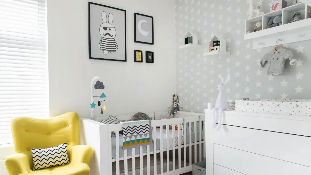
If I were designing from scratch, I would start with themes that feel recognizable but not visually noisy. The current nursery look is less about overdone baby blue and more about layered neutrals, natural textures, soft pattern, and one memorable idea that carries the room.
| Theme | Best palette | Why it works | What to watch out for |
|---|---|---|---|
| Woodland | Sage, cream, warm wood, charcoal accents | Cozy, timeless, and easy to age into toddler years | Too many animal prints can make it feel busy fast |
| Sky and clouds | Soft blue, white, pale gray | Light, calming, and strong enough to feel thematic without clutter | Overly literal ceiling decor can overwhelm a small room |
| Safari or jungle | Olive, tan, sand, black, ivory | Playful and flexible, especially when the animals are illustrated rather than cartoonish | Keep the palette muted or it can feel loud in a hurry |
| Nautical or coastal | Navy, white, driftwood, muted aqua | Classic, crisp, and easy to style with stripes or rope textures | Avoid leaning too hard into anchor-and-sailor decor |
| Space | Navy, slate, silver, white, midnight blue | Works well for a baby room and still makes sense later as a playroom | Dark walls need good light so the room does not feel cave-like |
| Transportation | Blue-gray, cream, red accents, graphite | Easy to personalize with cars, trains, trucks, and planes | Use the motif sparingly so it stays charming instead of cartoonish |
| Modern neutral | Ivory, sand, stone, soft black, muted blue | Very flexible, especially if you want the room to feel polished and not overly themed | Needs texture and contrast so it does not look flat |
I like this mix because it covers both ends of the spectrum: the room can feel whimsical, or it can feel calm and grown-up with only a few changes. Once that direction is clear, the next problem is avoiding the design traps that make a nursery feel crowded before the baby even arrives.
The mistakes that make a cute room feel overdone
I see the same nursery mistakes repeated over and over, and most of them are easy to fix before you spend too much money.
- Too many literal motifs. A room filled with moons, stars, planes, bears, and trucks all at once does not feel curated. Pick one main idea and let everything else support it.
- Matching everything too closely. When the rug, curtains, bedding, art, and storage all repeat the same exact image, the room stops feeling designed and starts feeling retail-driven. I prefer coordinated, not cloned.
- No visual rest. A nursery still needs blank space. A calm wall, a simple crib, or a plain lamp gives the eye somewhere to land.
- Ignoring scale. Oversized wall decals or murals can be lovely, but in a small nursery they can dominate the room. If the space is tight, one focal wall is usually enough.
- Choosing style over durability. Tiny decorative items look great in photos, but washable textiles, good storage, and sturdy furniture matter more once the room starts working daily.
The room usually looks better when one element does the talking and everything else stays quieter. After that, I look at the room itself, because light and square footage decide more than most people expect.
How I choose a theme that fits the room
Not every nursery can handle the same treatment. I always start with light, room size, and how long the space needs to stay useful. That tells me whether the theme should be bold, soft, or almost invisible.
| Room condition | What I would pick | Why |
|---|---|---|
| Small room or low natural light | Woodland, sky and clouds, or modern neutral | These keep the room open and calm, even if you add a deeper accent color |
| Bright room with decent square footage | Safari, nautical, or space | These themes can handle stronger color and a bolder focal wall without feeling heavy |
| Room that may become a playroom later | Transportation, animals, mountains, or outer space | These are easy to expand with books, toy storage, and playful wall art as the child grows |
| Rental or temporary setup | Modern neutral with removable wallpaper, prints, and textiles | You get a strong look without committing to permanent changes |
My rule is simple: if the room is compact, let the theme stay light and layered; if the room has space, let one bolder idea stretch. That naturally leads to the real question most parents have next, which is how much this actually costs.
What to spend on first and what can wait
A nursery budget can swing wildly, but a practical U.S. range is easier to manage than most people think. A simple refresh can land around $150 to $400 if you are keeping the existing furniture. A balanced mid-range room often runs $600 to $1,500, while a custom look with wallpaper, better furniture, and more finishing details can move past $2,000.
I usually split spending like this:
- Furniture: about 40% to 50% of the budget, because the crib, dresser, and chair do the most work.
- Sleep setup and window control: about 20%, especially if you need a quality mattress, blackout curtains, or a dimmable lamp.
- Textiles: about 15% to 20%, including the rug, changing pad cover, and washable curtains.
- Wall treatment: about 10% to 15%, which covers paint, peel-and-stick wallpaper, decals, or framed art.
- Accessories: the rest, ideally saved for pieces that actually add function, not just clutter.
If I know a room is going to become a playroom later, I spend more on neutral furniture and storage, then use the theme in rugs, prints, and baskets. That way I am not paying for a full redesign when the baby outgrows the nursery look. The next non-negotiable is safety, and this is the part I never treat as optional decor.
Safety choices that matter more than decor
The decor can be adorable, but the sleep space still has to follow safe infant-sleep basics. The CDC recommends placing babies on their backs for sleep, using a firm, flat sleep surface, keeping the crib in the same room as the parents when possible, and leaving soft bedding, pillows, bumper pads, and plush toys out of the sleep area. I treat that as the foundation of every nursery, no matter how styled the room becomes.
I also take furniture stability seriously. The CPSC Anchor It campaign is a good reminder to secure dressers, bookshelves, and TVs so they cannot tip as soon as a child starts pulling up or climbing. If you are adding open shelves or a changing station, anchor them before the room gets finished, not after.
- Use a fitted sheet only in the crib.
- Keep cords, blinds, and hanging decor out of reach.
- Choose a crib and mattress that fit together correctly.
- Anchor dressers and shelves to the wall.
- Keep the sleep area clear and separate from the display zone.
Once those basics are in place, the room can still feel warm and personal. The next layer is what makes it feel complete instead of assembled from a shopping cart.
The little finishing moves that make the room feel complete
The best nurseries usually do a few simple things very well. I do not try to fill every corner. Instead, I repeat colors, vary texture, and let the room breathe.
- Repeat the main accent color three times. If navy is the anchor, let it appear in art, one textile, and one accessory so the eye understands the theme.
- Mix hard and soft textures. Wood, woven baskets, cotton, and boucle keep a room from looking flat.
- Use one focal point. A mural, a framed print set, or a feature wall is enough. I do not usually need all three.
- Build in storage early. Closed bins, labeled baskets, and a dresser with real drawer space make the room easier to live in after the first few months.
- Think about the feeding corner. A comfortable chair, a small side table, and gentle lighting matter more than extra decor.
I also like to keep one or two items that can move with the room, like a reading basket, a simple rug, or artwork that is cute now but not babyish. That is what keeps the space from feeling frozen in one stage. In practice, that is the difference between a room with a theme and a room that can grow with the child.
A room that still works after the newborn stage
If I had to narrow the best nursery directions down to a few, I would choose woodland, space, coastal, transportation, or a soft modern neutral. They are cute without being fragile, and they leave room for growth when the nursery turns into a toddler room or a shared play space.
The trick is to let the theme guide the mood, not control every object in the room. Keep the crib setup simple, invest in the pieces that matter daily, and add personality through art, texture, and a few memorable details. That approach gives you a nursery that feels finished on day one and still makes sense when the toys start multiplying.