
Designing a nursery well means solving three problems at once: sleep, daily care, and a room that still feels beautiful after the first wave of excitement passes. The strongest baby girls room designs do not rely on pink alone; they balance calm, function, and a little personality so the space works for naps, feeds, and early play without feeling overdone. I start with safety and layout, then layer in color, texture, and a few details that can grow with the child.
What matters most in a baby girl's nursery
- Safety comes first. The crib and sleep area should be planned before the decorative pieces.
- Soft does not have to mean generic. A restrained palette can still feel warm, feminine, and personal.
- Storage matters more than people expect. Babies come with a lot of small items, and clutter shows fast.
- Spend on the pieces you touch every day. Crib, mattress, chair, and lighting should carry more of the budget than themed decor.
- One strong idea is better than five weak ones. A wallpaper, color story, or texture can anchor the whole room.
What the room needs to do every day
I always begin with the room’s job description, because nurseries fail when they are designed as photo sets instead of working spaces. A good nursery has to support sleep, diaper changes, feeding, soothing, and eventually a little floor play. If those tasks feel awkward, the room will never feel calm, no matter how pretty the wallpaper is.
In practical terms, I think in zones. The sleep zone should feel quiet and visually simple. The care zone needs easy access to wipes, diapers, creams, burp cloths, and spare clothes. The comfort zone is where the chair, lamp, and any late-night essentials live, because tired parents should not have to cross the room for every small thing. If the nursery also needs to function as a playroom later, leave a little open floor and avoid filling every wall with furniture.
One useful rule: if a piece does not help the room sleep better, store better, or care for baby faster, it should earn its place on style alone. That discipline makes the next choice, the color palette, much easier.
Color palettes that stay soft without feeling bland
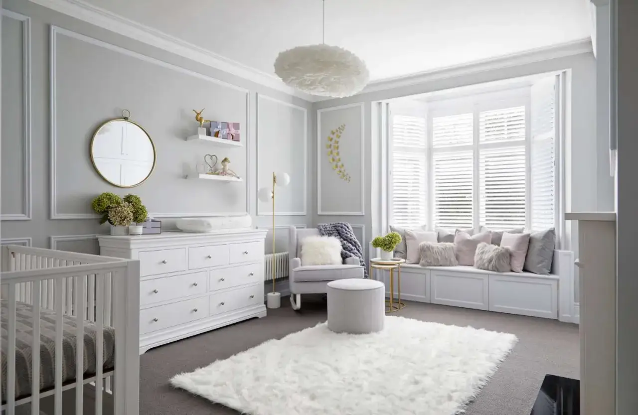
Pink is still a classic choice, but I would not build the whole room around a single candy color unless you want a very specific look. In most homes, the better approach is to choose one dominant neutral, one gentle accent, and one grounding material such as oak, walnut, cane, or linen. That combination keeps the room from feeling flat or overly sugary.
These are the palettes I reach for most often:
| Palette direction | Best for | Why it works | Watch out for |
|---|---|---|---|
| Blush, warm white, and oak | A classic baby girl nursery with a calm, soft look | It feels feminine without becoming overly themed, and oak keeps the room grounded | Too much blush can start to feel syrupy if every fabric matches exactly |
| Dusty rose, sage, and linen | Parents who want something gentler and slightly more grown-up | The green balances the pink and gives the room a fresher, more natural feel | Use muted tones only; bright sage and bright rose can compete instead of relax |
| Cream, butter yellow, and natural texture | Bright rooms that already get good daylight | It reads warm and cheerful without leaning into a strict “girl” formula | Yellow needs restraint; a loud shade can dominate a small nursery quickly |
| Mauve, taupe, and brushed brass | Rooms that need a little more polish | It feels a bit more tailored and mature, which helps the room age well | Keep the brass subtle; too much shine can make the space feel busy |
Right now, the strongest nursery palettes are less candy-coated and more layered. That shift makes sense, because the room has to evolve with the child, and color is one of the easiest things to outgrow. Once the palette is settled, the next question is how to place everything so the room actually works.
Layout and storage that make the room usable
A nursery can look tidy for five minutes and still be miserable to use if the layout is wrong. I like to place the crib first, then build the rest of the room around the shortest possible path for nighttime care. The changing setup should be close to diapers, wipes, and spare clothes, and the chair should be positioned so feeding does not require awkward twisting or reaching.
If the room is small, I would rather see a dresser doing double duty as a changing station than a separate changing table that eats square footage. Closed storage usually beats open shelving in a nursery, because open shelves fill up with visual noise fast. A few baskets are useful, but if every item is visible, the room starts to feel crowded long before it is actually full.
- Keep cords, curtain ties, and lamps away from the crib. Visual softness matters, but safety and reach matter more.
- Leave a clear path to the crib and the door. Night wakings are easier when you are not stepping around furniture.
- Store outgrown clothes separately. Mixing sizes is one of the fastest ways to create clutter.
- Plan one future play corner. A soft mat, toy basket, or low shelf can keep the room useful as the baby grows.
Once the room is practical, style stops fighting the furniture and starts supporting it. That is when the design can become more specific, which brings me to the looks that tend to work best.
Three design directions that work especially well
When I look at baby girls room designs that age well, I usually see one of three approaches: soft classic, modern organic, or storybook whimsy. Each can be beautiful, but they succeed for different reasons, and each carries a different level of visual commitment.
| Style direction | Core materials and colors | What it feels like | Best use case |
|---|---|---|---|
| Soft classic | Blush, ivory, scalloped trim, smooth wood, light brass | Elegant, familiar, and quietly feminine | Best when you want a timeless room that still feels warm and child-centered |
| Modern organic | Warm white, sand, clay, oak, boucle, rattan | Calm, airy, and less decorative | Best for parents who want the nursery to blend into the rest of the home |
| Storybook whimsy | Floral wallpaper, gentle animals, curved furniture, soft color accents | Playful, imaginative, and a little more expressive | Best when you want one strong focal point instead of many small decor items |
My rule with whimsical rooms is simple: let one element be the star. A mural, patterned wallpaper, or shaped headboard can carry the whole concept, but if you add three more competing ideas, the room starts to feel restless. That is especially true in 2026, when playful design is popular but still looks better when it is edited rather than overloaded. The best next step after style is not another decorative decision; it is making sure the sleep setup is genuinely safe.
Safe sleep choices that should shape the design
I never treat the crib as decor first. The sleep space has to meet safety standards before it gets to be beautiful. The crib should have a firm mattress, a fitted sheet, and nothing extra inside it. According to CPSC guidance, a safe sleep space is kept bare, and the crib should meet federal requirements rather than just looking sturdy from the outside.
The details matter more than most people think. Slats should be no more than 2 3/8 inches apart, and I would avoid any old drop-side crib altogether. The American Academy of Pediatrics also recommends a firm, flat sleep surface with no loose bedding, pillows, bumpers, or soft toys. That means the room can still feel soft and inviting, but the softness belongs in the rug, curtains, chair, and wall treatments, not inside the crib itself.
- Use the crib as a sleep tool, not a display shelf.
- Move decorative items out of reach once baby becomes mobile. What feels harmless at two months can become a climbing aid later.
- Choose blackout or room-darkening shades if naps are difficult. That helps the nursery work harder without adding clutter.
- Keep mobiles and hanging decor away from little hands. Decorative height is fine; reachable decor is another matter.
Once safety is settled, the room’s budget can be spent where it actually improves daily life instead of only improving the photo angle. That is where smart sourcing makes a bigger difference than most people expect.
Budgeting and sourcing without overspending
In a typical U.S. nursery, I usually see three useful budget bands. A light refresh can land around $500 to $1,500 if you are painting, reusing furniture, and buying only a few new pieces. A more complete nursery often runs $1,500 to $4,000 when you add a new crib, mattress, chair, rug, lighting, and window treatments. A more custom room with built-ins, wallpaper, and higher-end furniture can move well beyond that.
The smart move is not to spend evenly. Spend more on the pieces that get touched daily and less on the ones that are purely decorative. I would prioritize the crib, mattress, chair, lighting, and blackout shades. I would save on art prints, baskets, removable decals, and accent decor because those pieces are easier to swap later.
- Worth paying for: a solid crib, a comfortable chair, dimmable lighting, and a quality mattress.
- Good places to save: removable wallpaper, framed prints, throw pillows for the chair, and storage baskets.
- Best middle ground: a dresser that can later move into a toddler room or guest room.
- If the room is small: use fewer large pieces instead of many tiny ones.
I also think people overspend on themed accessories and then cut corners on the basics. That usually produces a room that looks busy but does not feel better to use. The easiest way to avoid that mistake is to know what not to do in the first place.
The mistakes that make nurseries feel crowded too fast
Most nursery problems come from too much specificity too early. The room should feel like it belongs to a baby girl, but it should not be so narrowly themed that it needs a redesign in twelve months. The design should leave room for growth, because babies become toddlers faster than anyone plans for.
- Overcommitting to one theme. Butterflies, bows, or florals can be lovely, but too many matching items make the room feel one-note.
- Using too many tiny decorative objects. Small items create visual clutter much faster than one large, well-chosen statement piece.
- Ignoring lighting. A nursery with only overhead light feels harsh at night, and a dimmable lamp makes a huge difference.
- Buying furniture that is too delicate or too small. The room needs pieces that can handle real use, not just a staged look.
- Filling every wall. A little blank space helps the room breathe and gives the strongest decor room to stand out.
If there is one practical lesson I would repeat, it is this: one clear idea beats a room full of competing cute things. That restraint is what keeps the room feeling fresh instead of overworked, and it leads naturally to the final layer of design, the details that make everything click.
The details that make the nursery feel finished
The last 10 percent of a nursery is usually not about buying more things. It is about editing. I like to finish with one art piece that carries emotion, one textured layer that softens the room, and one functional detail that quietly makes life easier, such as a charging spot, a drawer divider, or a basket for bedtime essentials.
A good nursery also needs a little personality that does not depend on trend chasing. That could be a scalloped lamp, a hand-me-down rocker, a small library shelf, or a patterned curtain that ties the palette together. If the room will later become a playroom corner, I would leave space for soft toys, book bins, and a washable rug so the room can evolve without a full reset. When those pieces are in place, the room feels calm on day one and still makes sense when the baby is older, which is the standard I use for every strong nursery design.The best baby room is the one that supports real routines first and decor second. If the space feels soft, safe, and easy to live in, the style will hold up long after the first round of gifts and the first wave of nursery excitement.