
Designing a baby room is easier when the paint plan is tied to how the space will actually be used: for sleep, quick changes, quiet feeding, and eventually a lot more movement and noise. A strong nursery painting idea is less about chasing a theme and more about choosing a palette, finish, and layout that stay calm, washable, and flexible as the room grows.
I usually start with three questions: How much natural light does the room get, how long do you want the look to last, and how much cleanup will the walls need to handle? Once those are clear, the right color family and paint finish usually become obvious.
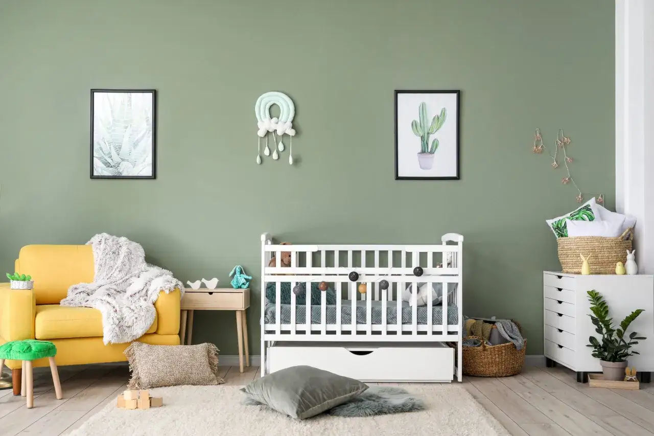
The best nursery colors are soft, washable, and easy to grow with
- Start with the light. North-facing rooms usually need warmer paint; bright rooms can handle cooler, quieter tones.
- Keep the palette narrow. Two to three colors is usually enough for a baby room.
- Choose a practical finish. Eggshell is the most balanced option for most nurseries.
- Use accents carefully. An arch, stripe, or mural can add character without making the room busy.
- Think beyond the crib. The best rooms can later work as a toddler space or playroom with minimal repainting.
What the room needs before color even matters
Before I pick a swatch, I look at the room itself. A small nursery with one dim window needs a different approach than a bright corner room with white trim and hardwood floors. Paint does not live alone; it reacts to light, flooring, furniture, and even the color of the rug.
- Natural light direction: North light tends to feel cooler, so warmer whites, beige-based neutrals, or soft yellow-greens can keep the room from feeling chilly.
- Room size: Smaller rooms usually benefit from lighter walls and a ceiling color that stays close to the wall tone.
- Furniture tone: White cribs, light oak, walnut, and black accents all change how the wall color reads.
- Future use: If the room will become a playroom later, avoid a palette that depends entirely on baby-themed decor to make sense.
I also recommend testing paint samples on at least two walls and checking them morning, afternoon, and evening. A color that looks soft in the store can turn muddy at home, and a gray that looks peaceful at noon can feel flat after sunset. Once the room’s lighting is understood, color choice becomes much less of a guessing game.
Calm colors that feel fresh instead of flat
In 2026, the strongest nursery palettes lean warm, natural, and slightly muted. That makes sense to me: a baby room should feel restful, but it should still have enough personality to avoid looking like a forgotten guest room. The best schemes usually borrow from nature rather than from overly bright primary colors.
| Palette direction | What it feels like | Works best when | Watch out for |
|---|---|---|---|
| Soft sage and olive-gray | Calm, grounded, and current | You want a gender-neutral room that pairs well with wood and white | Too much gray can feel dull in low light |
| Warm white and cream | Bright, airy, and flexible | The room is small or you want the decor to do more of the visual work | Needs texture so it does not look sterile |
| Dusty blue and slate blue | Quiet, classic, and sleep-friendly | You want a cooler room that still feels soft and welcoming | Very icy blues can feel remote instead of cozy |
| Butter yellow and oatmeal | Warm, cheerful, and friendly | The room faces north or needs a little warmth | Use a muted shade, not a bright lemon tone |
| Muted blush or clay | Gentle, modern, and a little more expressive | You want warmth without going into overtly themed pink | Keep it understated so the room still feels restful |
If you want the safest path, I would start with one base wall color, one trim color, and one accent tone repeated in a rug, curtain, or mobile. That is enough to make the room feel designed without crowding it. From there, the real personality usually comes from the way the walls are handled, not just the color itself.
Accent walls and murals work best when they stay simple
Accent treatments can make a nursery feel custom, but they are easy to overdo. I prefer one strong visual move rather than several competing ones. If you want the room to feel memorable, give it one focal point and let the rest of the walls stay quiet.
- Painted arch behind the crib: This is one of the easiest ways to create a focal point. It works because the curve softens the room without adding clutter.
- Horizontal color block: A lower wall in a deeper shade can anchor the room, especially if the furniture is light.
- Soft mural or mountain line: Best for parents who want character without cartoon styling. Keep the shapes large and the colors muted.
- Thin stripe near the ceiling: A good choice if the room is small and you want subtle detail rather than a full feature wall.
- Ceiling color wash: Useful in very plain rooms, but it works best when the rest of the room stays restrained.
The rule I use is simple: if the accent wall introduces a new color, repeat that color somewhere else in a smaller dose. That keeps the room from feeling accidental. A mural or painted shape should support the room, not steal the entire scene. Once you decide on the visual treatment, finish becomes the next big decision.
The right finish makes cleanup easier without looking shiny
Nursery walls need to look soft, but they also need to survive fingerprints, scuffs, and the occasional mystery mark. That is why finish matters almost as much as color. A gorgeous shade in the wrong sheen can feel either too fragile or too glossy for a baby room.
| Finish | Look | Best use | Tradeoff |
|---|---|---|---|
| Matte | Very soft and velvety | Walls with minor imperfections and rooms where a cozy look matters most | Harder to wipe clean |
| Eggshell | Low sheen, still understated | The best all-around nursery choice for most baby rooms | Not as scrub-friendly as satin |
| Satin | Noticeably smoother and a bit more reflective | High-traffic nurseries or rooms moving toward toddler use | Shows wall flaws more easily |
| Semi-gloss | Brighter and more reflective | Trim, doors, and detailed woodwork | Too shiny for most full nursery walls |
I usually recommend eggshell for the walls and a slightly tougher finish on trim and doors. That combination gives you enough wipeability without making the room feel like a hallway or bathroom. If you choose a low-VOC or zero-VOC product, you also reduce the chance that the room smells harsh for days after the job is done. The finish may look like a small decision, but it changes how easy the room is to live with.
How to paint safely before the baby moves in
Safety matters here, and I would not gloss over it. The EPA notes that VOC concentrations are often higher indoors than outdoors, which is one reason ventilation matters so much when a room has just been painted. Even if the walls look dry, the room can still carry odor and emissions for longer than people expect.
- Choose a low-odor product. Low-VOC or zero-VOC is usually the direction I’d take for a baby room.
- Ventilate aggressively. Open windows, use a box fan in the window to push air out, and keep air moving across the room.
- Paint early. Do the job before furniture is fully set up so you can work faster and air the room out better.
- Let it rest. CPSC guidance advises avoiding freshly painted rooms for 2 to 3 days whenever possible.
- Wait for the smell to fade. If the room still has a strong odor, it is too soon for a newborn to sleep there.
I also like to keep babies and pregnant family members out of the room during painting and cleanup, not just during the first coat. The practical test is simple: if the air still feels sharp to you, it is not ready. After the room has aired out and the smell has dropped to a faint trace, you can start bringing in bedding, books, and soft furnishings.
Mistakes that make a nursery feel smaller or busier than it should
The easiest nursery mistakes are the ones people do with good intentions. They want the room to feel special, so they add more color, more theme, and more contrast than the space can handle. I see that often enough to call it a pattern.
- Using too many strong colors: Three bold hues in one small room usually feels restless, not playful.
- Choosing a cold gray with no warmth: In many nurseries, it ends up looking flat instead of soothing.
- Making the walls and ceiling equally dark: This can shrink the room fast, especially if there is limited daylight.
- Relying on a theme for the whole design: Animals, clouds, stars, or rainbows can work, but they should not take over every surface.
- Picking a finish that is too shiny: Full-wall gloss or heavy sheen tends to look more intense than parents expect.
My rule of thumb is to keep the most saturated color in the room somewhere small: a print, a pillow, a book spine, or a toy bin. The walls should support the mood, not compete with every object in the room. Once you avoid those traps, the room starts to feel calmer almost immediately, and that opens the door to a design that can last past the infant stage.
Design for the toddler version of the room, not just the crib stage
The best nursery paint plan is the one that does not become obsolete the moment the crib comes out. I like rooms that can shift from baby room to playroom with a few swaps rather than a full repaint. That means choosing colors with enough restraint to survive new furniture, toy storage, and louder decor later on.
What works best is a simple formula: one calm base color, one supporting neutral, and one repeatable accent. For example, sage walls with cream trim and walnut furniture can later handle colorful toy bins, picture ledges, and a reading corner without feeling chaotic. A dusty blue room can do the same job if you keep the bedding and accessories warm.
If I were planning this from scratch, I would also leave one wall visually quiet so it can take shelves, framed art, or a play area later. That small bit of restraint saves a lot of repainting. In the long run, the smartest nursery is the one that still feels intentional when the room stops being a nursery at all.